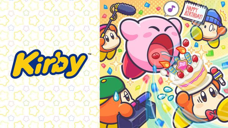
Ex-Nintendo Staff Reveal Secrets of "Angry Kirby"

Former Nintendo employees have shed light on why Kirby's appearance differs between the U.S. and Japan, highlighting Nintendo's strategic localization efforts to cater to Western audiences. Dive into this article to uncover the reasons behind Kirby's altered marketing and Nintendo's evolving global approach.
"Angry Kirby" Was Made To Appeal To Wider Audiences
Nintendo Rebranded Kirby For More Appeal In The West
Kirby's appearance was intentionally made to appear fiercer and tougher on game covers and artworks to appeal more to American audiences, earning the nickname "Angry Kirby" among fans. In a January 16, 2025 interview with Polygon, former Nintendo Localization Director Leslie Swan elaborated on the company's rationale for altering Kirby's look in Western markets.
Swan clarified that the intent in the early 2000s was not to make Kirby look angry but to convey determination. She stated, "Cute, sweet characters are popular among people of all ages in Japan." However, she noted, "In the U.S., tween and teen boys are more drawn to tougher characters."
Shinya Kumazaki, the director of Kirby: Triple Deluxe, in a 2014 interview with GameSpot, echoed that sentiment. He explained that while cute Kirby attracts more players in Japan, a "strong, tough Kirby that’s really battling hard" resonates better with U.S. audiences. Yet, he acknowledged that the approach can vary by title, citing Kirby Super Star Ultra's use of a tough-looking Kirby on both U.S. and Japanese box art. Kumazaki emphasized that while showcasing Kirby's serious side through gameplay was important, the character's inherent cuteness remained a major draw in Japan.
Advertising Kirby As "Super Tuff Pink Puff"
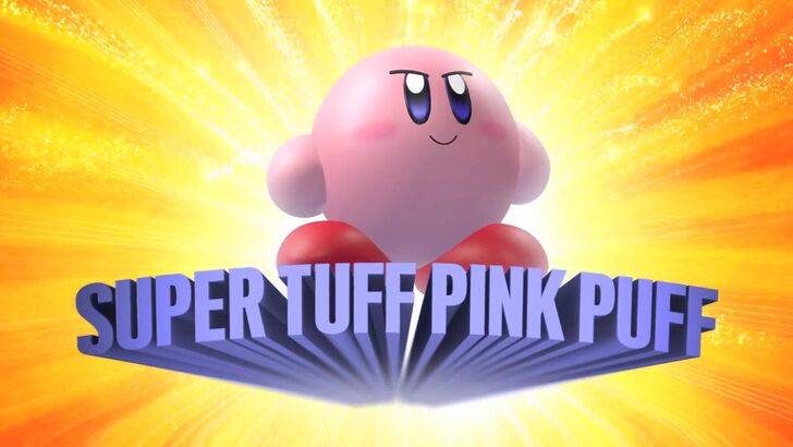
Nintendo's marketing strategy aimed to broaden Kirby's appeal, particularly to boys, by branding him as "Super Tuff Pink Puff" in the 2008 Nintendo DS game, Kirby Super Star Ultra. Krysta Yang, a former Public Relations Manager at Nintendo of America, revealed that the company sought to shed its "kiddie" image during her early career. "There was a period where Nintendo, and gaming in general, wanted to project a more adult and cool image," she remarked. Yang further explained that being labeled as 'kiddie' was detrimental to game sales.
Nintendo's marketing efforts focused on emphasizing Kirby's toughness and the combat aspects of its games to avoid being pigeonholed as entertainment solely for young children. In recent years, as seen in promotional materials for Kirby and the Forgotten Land in 2022, the focus has shifted more towards gameplay and abilities rather than Kirby's personality. Yang observed, "There’s been a continuous effort to portray Kirby as a more well-rounded character, but most people still see Kirby as cute rather than tough."
Nintendo’s U.S. Localization For Kirby
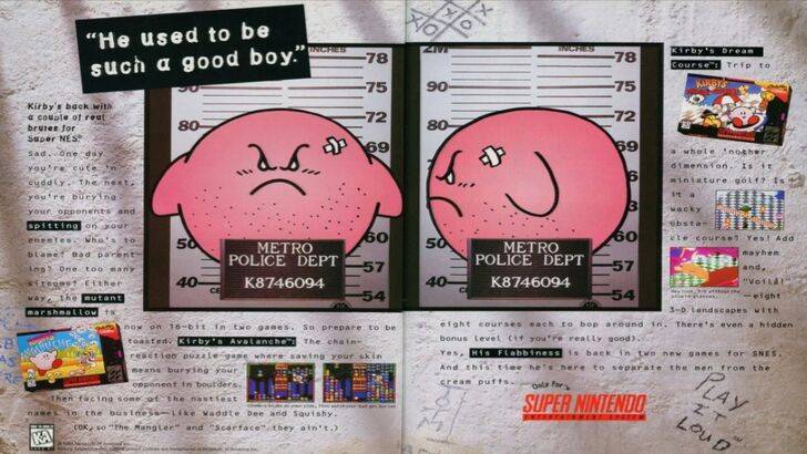
The localization differences for Kirby between Japan and the U.S. were evident as early as a 1995 print ad, part of Nintendo’s "Play It Loud" campaign, which featured Kirby in a mugshot pose. Over the years, Kirby's box art varied significantly, with titles like Kirby: Nightmare in Dream Land in 2002, Kirby Air Ride in 2003, and Kirby: Squeak Squad in 2006 showcasing Kirby with sharp eyebrows and a more menacing expression.
Beyond facial expressions, Nintendo made other adjustments to Kirby's appearance for Western audiences. In 1992, Kirby's Dream Land for the GameBoy introduced the series, but its U.S. box art depicted Kirby in a ghostly-white tone, contrasting with the original Japanese pink hue. The GameBoy's monochrome display meant U.S. players did not see Kirby's pink color until Kirby's Adventure was released on the NES in 1993. Swan noted this change posed a challenge, stating, "A puffy pink character for boys who are trying to be cool just wasn’t going to drive the sales everyone hoped for."
This led Nintendo of America to modify Kirby's facial expressions on U.S. box art to attract a broader audience. In recent years, Kirby's global advertising has become more consistent, alternating between serious and gleeful expressions.
Nintendo’s Global Approach
Both Swan and Yang highlighted that Nintendo has adopted a more global perspective in recent years. The collaboration between Nintendo of America and Nintendo's Japan office has strengthened, aiming for more consistent marketing and localization strategies. The company is moving away from regional variations, such as those seen in Kirby’s box art and the 1995 "Play It Loud" campaign.
Yang pointed out that the global audience's preferences have not shifted significantly, but the approach to marketing has. She explained, "It was a strategic move towards more global marketing. It has its advantages and disadvantages. Global consistency strengthens the brand across regions, but sometimes it overlooks regional nuances." She expressed concern that this could result in "bland, safe marketing" for some of Nintendo’s products.
Game localizers attribute the current trend towards less localization to the broader globalization of the industry and the increasing familiarity of Western audiences with Japanese culture, including games, movies, manga, anime, and other media.
Latest Articles
Trending Games


![Taffy Tales [v1.07.3a]](https://imgs.anofc.com/uploads/32/1719554710667e529623764.jpg)


Top News
Latest Games